It’s time for the Fall 2016 Pantone Colors. This year’s fall palette includes gorgeous shades of blue, red, taupes, golds, greens, and grays. Bright Settings offers many of these same colors in table linen. Of course, the colors go by different names. Below you can see Pantone’s top ten autumn colors alongside the tablecloth fabrics that most closely match them. The swatches are from our line of Basic Polyester table linens, far and away the most popular (and least expensive) rental fabrics available. If you’re planning a fall wedding or special event, renting large quantities is a smart move. However, if you want just one or two for your linen closet, they can also be purchased. Bright Settings rents 58 colors of basic polyester and sells 72 colors! With that kind of selection, you’re sure to find the perfect color for your dining room this fall.
Riverside (PANTONE 17-4028)
I love how colors are described on Pantone’s website. Riverside Blue is extolled as “cool and calming, strong and stable.” Bright Settings has a lovely shade of blue called Slate that closely resembles Riverside Blue. It, indeed, is cool, calming, strong, and stable;-)
Airy Blue (PANTONE 14-4122)
This lighter shade of blue is a breath of fresh air. Maybe that’s where Pantone got the name? Bright Settings’ rendition of this gorgeous hue is called Light Blue. It’s light and airy, or as Pantone says “weightless.”
Sharkskin (PANTONE 17-3914)
This version of gray is a must have for the fall season. It goes with so many autumn colors, be they bright or muted. Maybe that’s why Charcoal is one of our most popular rental colors for weddings and special events.
Aurora Red (PANTONE 18-1550)
Pantone’s Aurora Red is touted as warm, sensual, and immediately pleasing to the eye. The same can be said for our Cherry Red tablecloths. Cherry Red pairs perfectly with a wide range of fall colors and carries over nicely into the holidays.
Warm Taupe (PANTONE 16-1318)
Did you know that, in Japan, taupe doesn’t just refer to the brownish-gray color we think of when we hear that word. Taupe is more of a mindset or a mood. Taupe colors are serene and tranquil. They’re produced by toning down pure colors with gray. As a quilter, I’m fascinated with Japanese taupes and have quite a nice collection in my fabric stash. Bright Settings also has some glorious taupes, my favorite being Toast. This is one of the fall 2016 Pantone colors that can actually calm down the riot of color found in a typical fall tablescape.
Dusty Cedar (PANTONE 18-1630)
Dusty Cedar is Pantone’s fall version of their pinks from last spring. Described as a dusty rose-tone, it matches up perfectly with our Dusty Rose table linen. This is one of those colors which photos don’t do justice to. It’s an old-fashioned color punched up for modern decorating.
Lush Meadow (PANTONE 18-5845)
Pantone claims that this complex shade adds depth and panache to natural green. I must agree. It’s a very interesting shade that reminds me of Bright Setting’s gorgeous Hunter tablecloths. Hunter is fast becoming one of our most popular rental colors. And if you purchase a Hunter tablecloth, you can pull it out of your linen closet for both autumn and Christmas holidays!
Spicy Mustard (PANTONE 14-0952)
I love the name and I love the color. I’ve seen some gorgeous leather handbags made from this rich shade of yellow. At Bright Settings, we carry a spicy fabric called Goldenrod. It is my personal favorite in the yellow/gold family because it goes well with so many other autumn colors in the orange, brown, red and green families.
Potter’s Clay (PANTONE 18-1340)
Pantone’s favorite shade of orange for this fall has undertones of russet and earth tones. Bright Setting’s version of Potter’s Clay is called Burnt Orange. As you can imagine, it is one of our most popular rental colors in the fall.
Bodacious (PANTONE 17-3240)
A few years ago my husband and I stopped at a roadside stand to buy corn on the cob. When we asked the Amish boy what kind of corn it was, he answered, “Bodacious!” The juxtaposition of that modern word coming out of the mouth of this not-so-modern teenager cracked us up. Now neither one of us can hear the word bodacious without chuckling out loud. It’s a fun word and it’s a fun color. Bright Settings has a similar color called Plum that is very popular these days. It pairs nicely with silver and charcoal as well as other autumn colors.
Fall is my favorite time of year for decorating around the house. I’m more than happy to let the color professionals at Pantone do the heavy lifting when it comes to choosing the perfect fall palette. The great thing about the fall 2016 Pantone colors is that they’re not just trendy at the moment, they’re timeless. Bright Settings’ fall palette of table linen is also timeless. The solid colors of our 100% polyester tablecloths can be used year after year because they’re always fashionable and are very durable. Want to see these fall colors up close? Order free fabric swatches from our website or call 800-327-6025 for more information. Bright Settings has you covered this fall!


Recent Comments
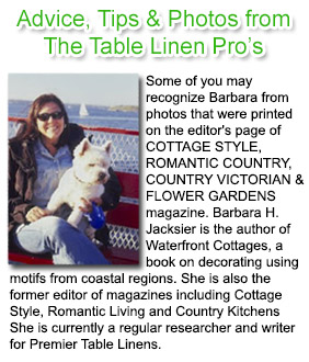
Lori hall
on Fall Into Luxurious Textures with Miranda Damask by Premier Table LinensLori Hall
on The Havana Linen CollectionMichelle
on Fire Regulations Pertaining To Table Covers, Skirts, Stage Skirting and Drapes At Trade Show Exhibits & Public VenuesHoliday Inn Express-SLFMS Sulphur Louisiana
on A.C.T.S. (Any Custom Tablecloth Size). Now you can price and purchase any custom size tablecloth in the world only at Premier Table Linens.