Tired of white on white table linens? Looking for a new color scheme? Want a fresh seasonal look that reflects your personality? Color is key.

You’ve probably heard it before, but it’s worth repeating… choosing colors is an art! Picasso might not be considered a legendary painter, if he never moved on from his “blue period”. Van Gogh might be an unknown Dutch artist if his sunflowers were rendered in shades of black and white. You get the picture. Color is what elevates the ordinary.
FIND YOUR INSPIRATION
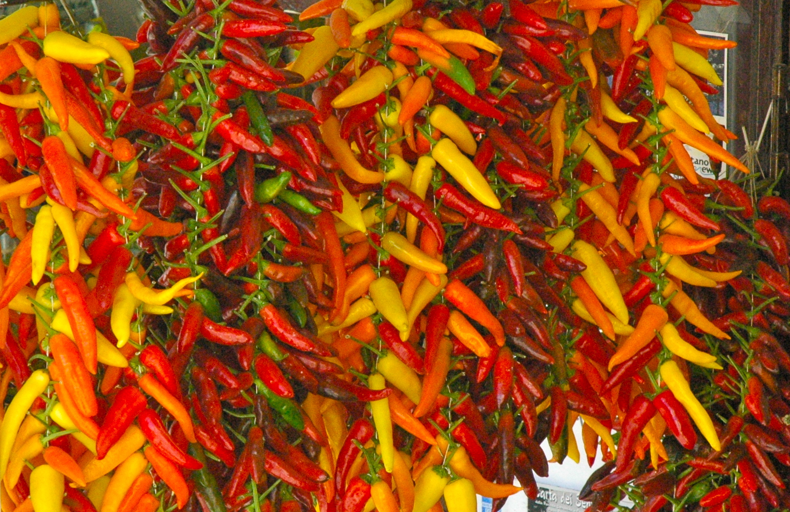
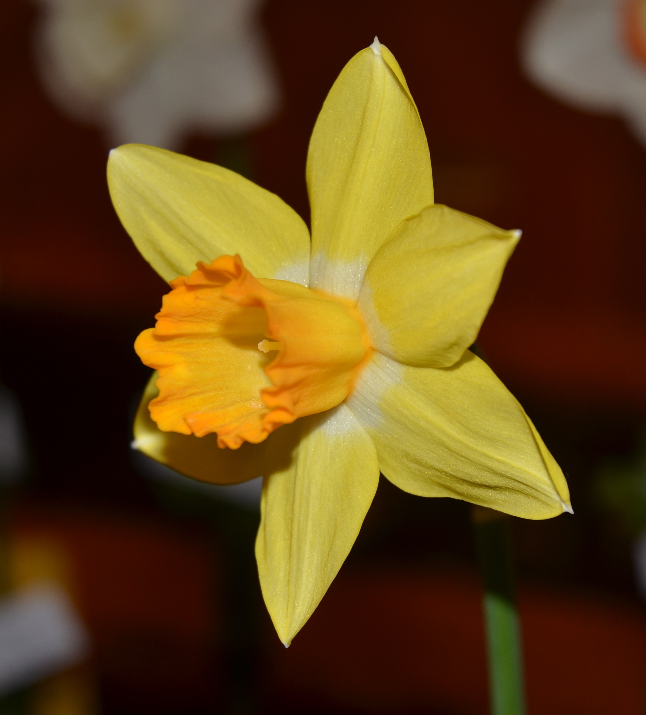
The starting point for a new palette could be as close as the china in your cupboard or the daffodils growing in your garden. A visit to a local botanic garden, flower shop or plant nursery will provide endless ideas for attractive color combinations.
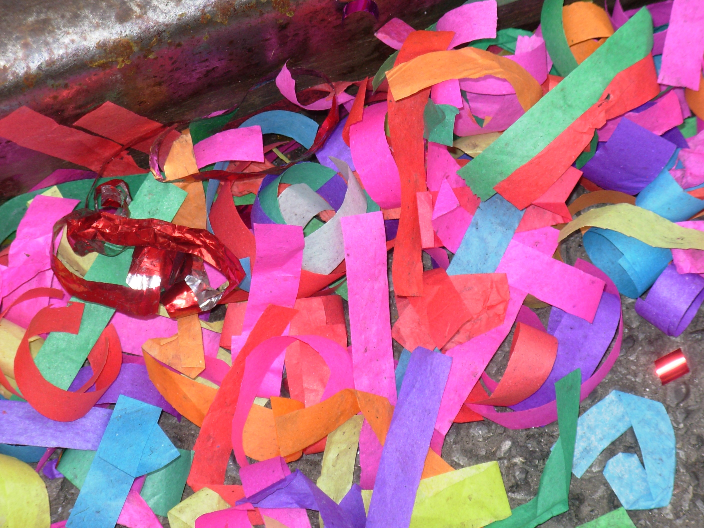
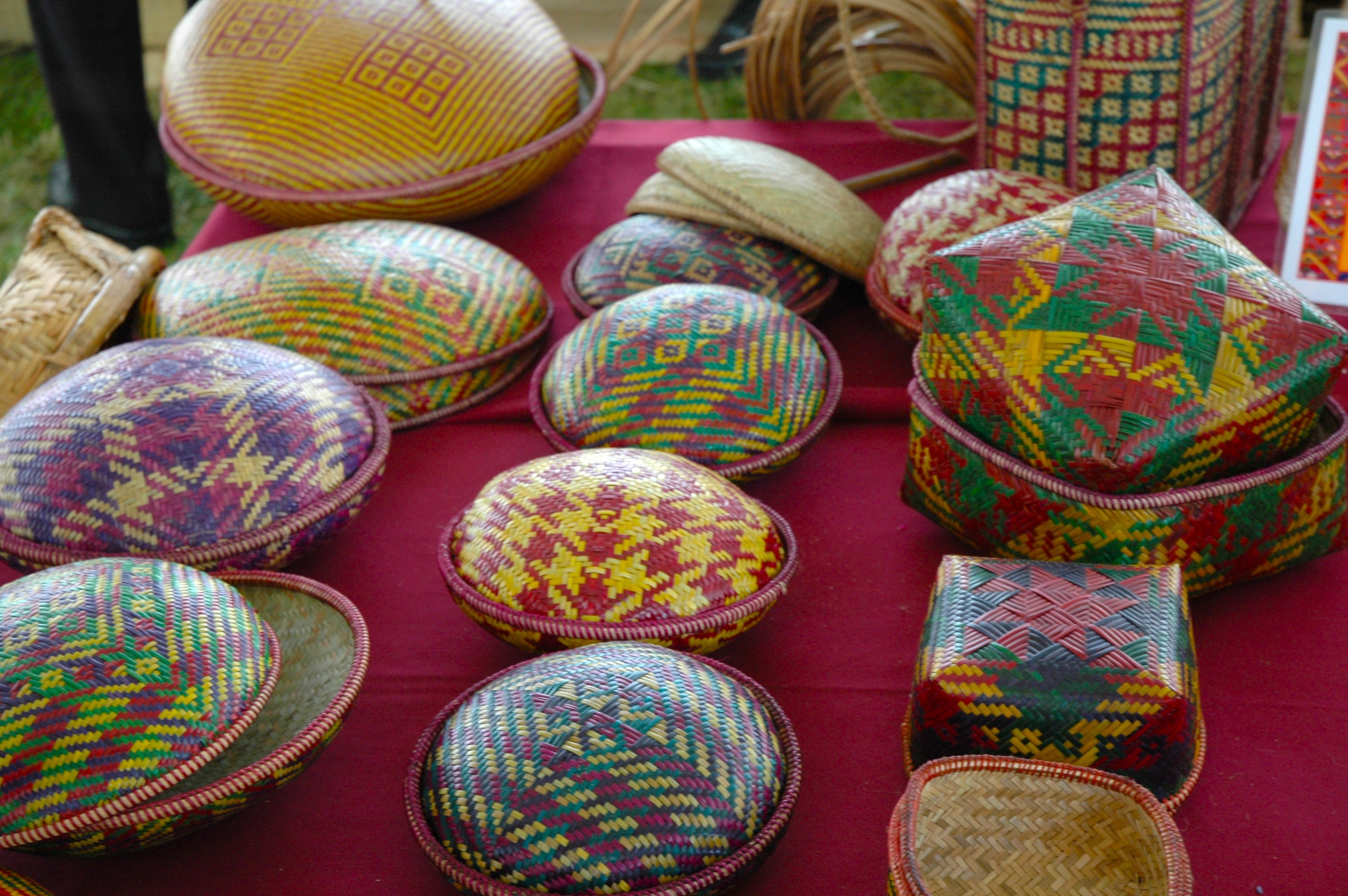
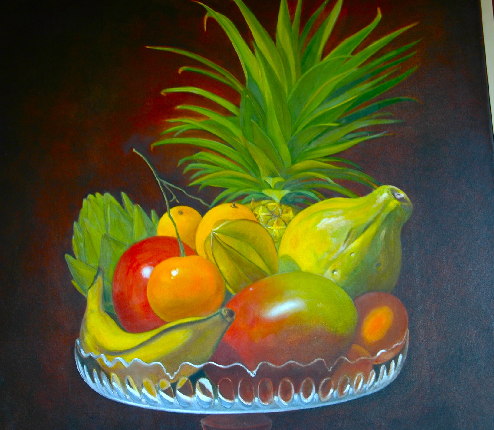
I love borrowing elements from nature— butterflies, ripe persimmons, a tranquil lagoon—as well as color schemes inspired by other cultures and countries. A global perspective has the ability to add a hint of exoticism to both everyday and special occasion tablescapes.
Re energize your table style by concocting color palettes that reflect a Chinese tea house, a gypsy-bright caravan or a dazzling Italian palazzo. By mixing and matching tablecloths, overlays, runners and napkins, anything is possible!
Did you know that Premier Table Linens rents an assortment of fine linens at affordable prices? Renting further expands your options guaranteeing memorable events.
TUNE INTO TONES
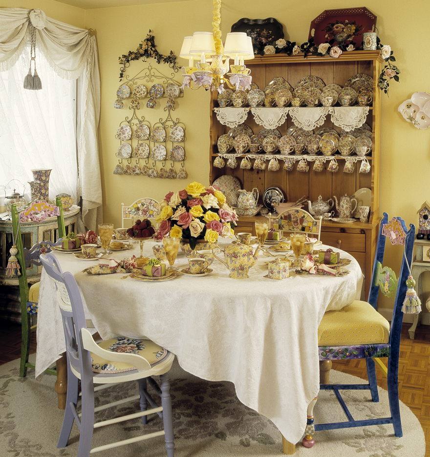
As a general rule, it’s best to choose lighter tones, such as ivory, rose, lilac or sage green, or mid tones, including tangy yellows, saucy blues or perky plums and purples, for daytime events. I love creating one-of-a-kind table designs layering Premier Table Linens’ Tissue Lame in colors that echo tropical fruit, a collection of sea glass or an English rose garden in bloom. A potpourri of napkins is an easy way to add color to your event.
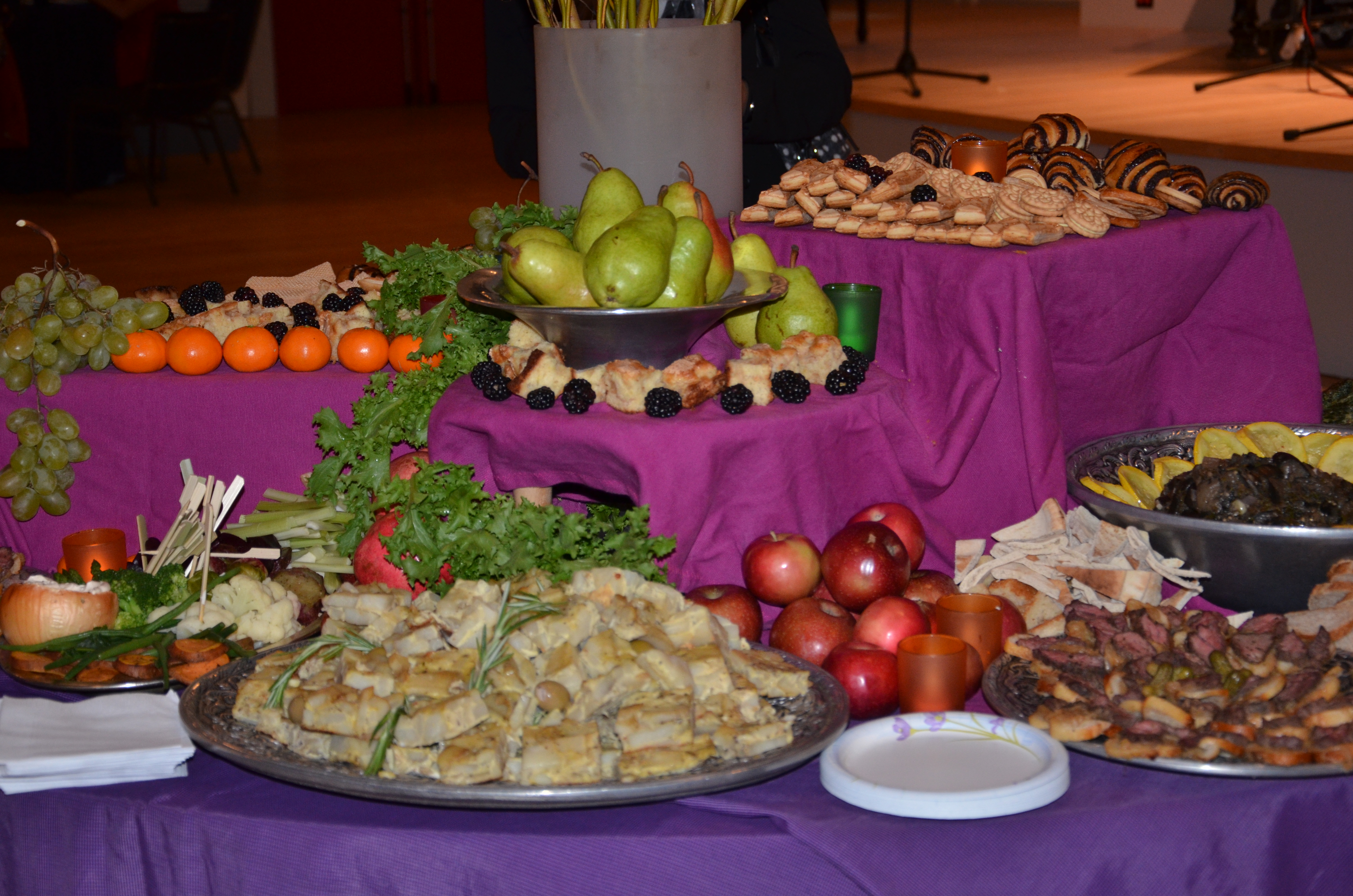
In the evening, I like to go with darker tones to add drama. Consider regal colors and jewel tones, translate your after-dinner espresso a color scheme or serve up a buffet of ripe harvest hues.
SHADES OF MEANING
Once you’ve decided how light or dark to go, it’s time to consider the illusions produced by different shades of the same color. Think about the many moods of blue.
From glacial hues of icy blue to calming Mediterranean turquoise, heavenly periwinkle to glistening sea glass shades—the chameleon quality of blue can transform a room into a coastal fantasy, a celestial haven or a patriotic salute.
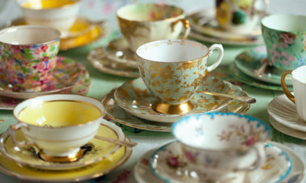
The red family is equally varied. Check out Premier Table Linens’ reversible Majestic table linens color choices. From coral that evokes the gracious south to burgundy that flows like fine French wines, raspberry that seems as cool and fresh as sorbet and holiday red that is equally at home for the Fourth of July as the 25th of December, color names are a good clue to the look you can create with a specific shade.
WORKING WITH WHITE
Symbolic of purity and simplicity, white is the color of choice for many catered occasions. Event planners turn to white to expand small rooms, bring a lighter look to dark banquet halls and let the guests’ fashions take center stage.
To avoid an institutional effect in large rooms, I recommend accenting basic white cloths with a hint of texture or color. For white on white choose one of Premier’s damasks, Bombay Pintuck or shimmering Crinkle Taffeta. Smooth white undercloths can also be enlivened with sheer or textured white fabrics. Scrunched Organza makes an all white setting look downright dreamy.
DO SOMETHING DIFFERENT
Pairing colors with a sense of adventure is the path to creating excitement. Whether you want to spice up your next conference, family gathering or baby shower, choosing a color theme that is out of the ordinary will create the buzz you’re after.
Let’s go back to blue. Mix with cream or silver for understated elegance or pure white for a fresh bright look. Royal blues can be teamed with coral, gold or garnet for tablescapes that reverberates with jewel like panache. Leafy greens are a natural companion for Wedgewood or Caribbean shade linens. For tables as evocative as a butterfly on a misty morning add accents borrowed from nature— pale mint, lilac or lime.

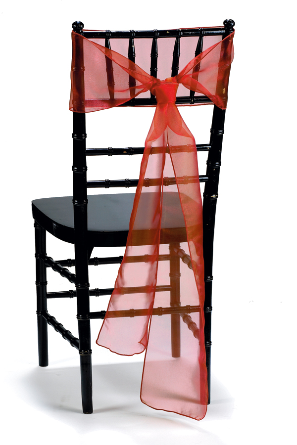
Colors that aren’t frequently used together often look terrific when the intensities are modulated. Some browns and blues can look jarring side-by-side, but mixing dark chocolate brown and pale robin’s egg blue looks absolutely stunning. I find that combining solids and sheers is another surefire trick. Wrap painted chairs with bows of Premier’s Radiance. Black and red look simply sensational!
Want to discover color pairings that might never have occurred to you? Look at a museum exhibit of Egyptian artifacts, do an image search for the color aqua, or browse a fabric shop for patterns featuring interesting color ways. Don’t be afraid to experiment with fabric swatches until you come up with a palette that pleases you. Be aware that colors produce different effects in different light, so view your choices at different times of day, in both natural, electric, and candlelight.
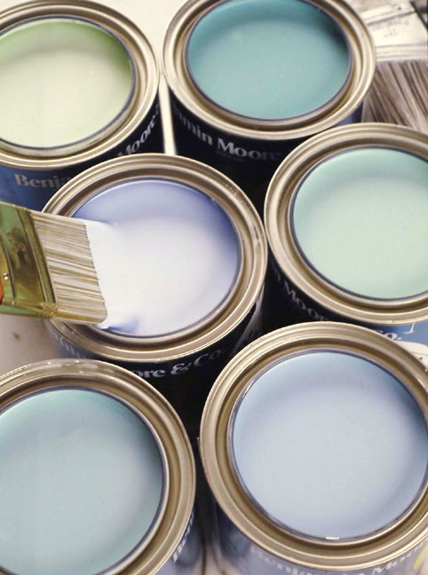
If choosing colors from a web site, please note that the colors on your screen may differ from the true color of the fabric. Computer monitors do not replicate colors the same way as they are seen by our eyes. For this reason Premier Table Linens offers swatches of every color in the fabric you are considering for only $2.95. For example, if you are interested in Poly Premier linens you will receive all 74 colors!
Ordering swatch cards is also a great way to determine how fabric textures will look together. Premier Table Linens includes a full size napkin sample with each swatch card ordered to help you decide on the best fabrics for you. It gets even better. After seeing the color swatch cards in person, putting the color swatch up next to your china or in the light of room where the tablecloths will be and determining the colors you like, you can return the color swatch cards to Premier for a refund or keep them for any future decisions.
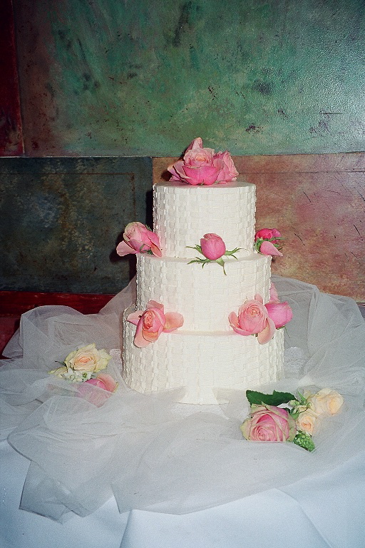
MAKE A LOVE MATCH
Need help choosing a bouquet of colors for your wedding celebrations? To get a sense of which colors appeal to you many professional wedding planners suggest creating a style file. Create a Pinterest board online from inspirations you find on websites and blogs or tear pages out of magazines (they need not be bridal ones).

After you’ve gathered clippings for a while, you will probably notice that you are you drawn to one particular color. Is there a pairing that repeatedly catches your eye? Don’t worry if your colors aren’t traditional wedding ones. The most romantic palette is not the one that everyone else thinks is perfect. It’s the one that sets your heart aflutter!


Mary Karas
on September 4, 2014 at 8:08 amAlways look to nature for color combinations. I painted my living room a shade of green and purchased brown and green upholstered pieces for the room. A neighbor came over to see the newly decorated room and said I would never have thought to put green and brown together – it’s lovely.
Ryan
on September 4, 2014 at 10:07 amSo true Mary. Thank you so much for sharing. The same applies to table linens and decor.
Eileena
on August 26, 2013 at 6:09 pmWhat a lovely blog!
Anastasia
on July 15, 2013 at 5:24 pmReally enjoyed this blog. Gave me many great ideas. Thank you,
Anastasia